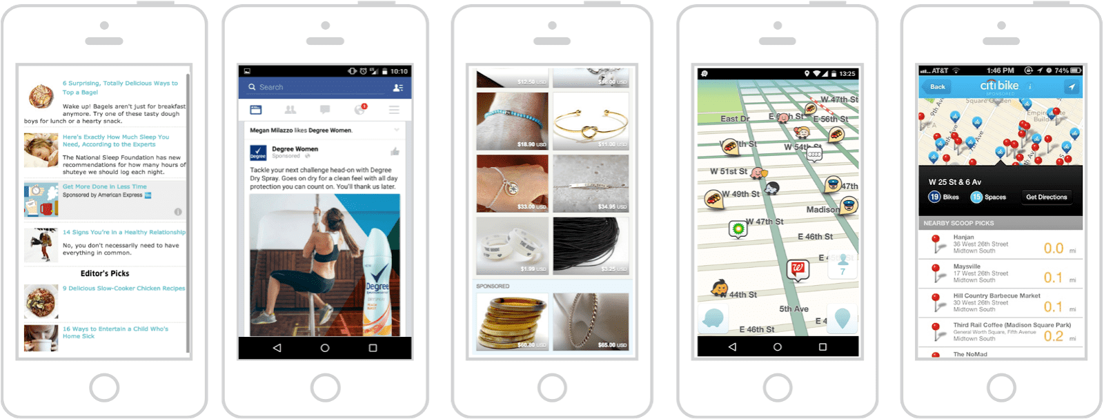
Nowadays almost all users tend to improve the productivity by browsing information and search for needed solutions on their mobile devices rather than on computer desktops. As a consequence, they are bombarded with ads that don’t quite integrate with their user experience. Desktop banner ads are not compatible with mobile devices. On smaller screens they look minute and indecipherable. Besides, they appear on the screen chaotically paying attention to surrounding content and disrupting messages.
There had to be a more efficient way for advertisers to bring content to smaller screens and get the attention of users in a productive way – native ads have appeared as a solution for this problem.
Native advertising
Is a paid media content that is allocated within editorial content, is relevant to the topic in which it is placed, and has the same visual look as the context. This type of advertising has to harmonize completely with the publisher’s property but still be distinct and catch the eye of the user.
On mobile devices, native advertising manages to find the right balance between attracting attention and blending in by matching the design and content of the site or app where it appears. It has to be truly remarkable and on point to provide a deeply engaging experience.
Despite the benefits that native mobile advertising has, many brands still don’t use its true potential. So, if you don’t know where to start, look through our handy tips:
Tailoring ads to adjust to different publications
Native advertising has to look and feel natural on any platform. So two important points that you have to implement are:
- a copy has to be put in the specific context of the publications you want to reach;
- a copy has to be fine-tuned to your individual business goals.
Choosing the right format of native ads
Choosing the right format and creating the right content for the right type of mobile web page is crucial to native mobile advertising. Here are the options that are most commonly used:
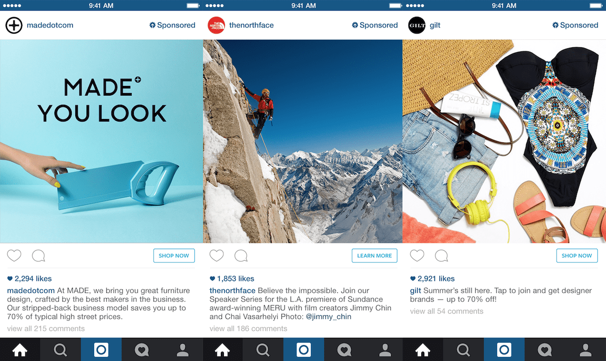
- In-feed units. This advertising exists in two forms: sponsored content and in-feed promotions (BuzzFeed, Gawker, Wired, Facebook, LinkedIn).
- Paid search units. Paid search ads appear along with organic search results on search engines. The only difference is that they are labeled as being sponsored.
- Recommendations units. These ads appear based on the context of what a user is reading and searching. They are labeled as “suggested reading”.
- Promoted listings. Such ads are based on a user’s browsing history. They fit smoothly and logically into the browsing experience (Amazon, Etsy).
- In-ad with native element units. These ads look just like standard banner ads placed outside the editorial but are relevant to the page content.
- Custom / “Can’t Be Contained”. This category is for ads that don’t fit in none of the above formats.
Sometimes short is better than long
Today’s users have quite hectic lifestyles and want to consume information on the go in the most effective way possible. Long content will be ignored. It’s not something you want to spend your time on.
So in order to have a successful marketing campaign, make sure your mobile ads are short, on-the-spot, newsy and informational.
Branding
The sole purpose of advertising and branding is to bring revenue. But they each do it differently.
Branding is about corporate identity. It tells people who you are, what’s your name, and what you do. It gives your business a sense of individuality, makes people remember you and your product. Effective branding can save or drown your campaign. If run on mobile devices, campaigns with weak branding often lead to lower brand awareness.
Mobile ads have only a few seconds at their disposal to make an impression on the user before he or she swipes to the next piece of content in their feed. This means that if your creatives don’t demonstrate clear branding, your ad will be left unnoticed. If users neglect your brand. Your efforts will go to waste.
Keeping messaging simple
Mobile native ads have only a few seconds to win in the hunt for users’ attention. This means that if a user can’t grasp your message in two seconds or less, you need to make it more simple. Bypass complicated vocabulary and figures of speech. The best ads are easily perceived even after one glance.
One more thing about native ad copy – don’t try to sell. Provide content that might be of value for your target audience. Simply pushing a product will do no good.
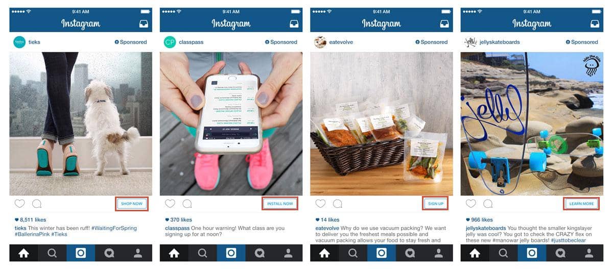
Calls-to-action
The call-to-action (CTA) can influence users’ behavior and decision making. It can persuade a person to stop, read your ad and then click on it. The challenge here is that you have only microseconds to grab attention and convince a user to do so.
Effective text and image can trigger curiosity and thus lead to higher traffic, click-through rates and conversions. So persuade your reader to give your ad attention and then take an action.
Infinite scrolling
Infinite scrolling was made popular by social networks. It means that contents loads as the user scrolls down a webpage.
That’s an awesome idea for readers but a bad news for advertisers. Why? Because people tend to scroll fast, so ads don’t have enough time to load, and view ability decreases.
The solution is to design ads accordingly by keeping file sizes low to reduce long loading times on the page, and optimizing your ads for split-second viewing.
End of the line
These days mobile-ready sites are a necessity. Deliver your content in such a way that mobile users will definitely enjoy. By paying attention to the points mentioned above you should be able to improve your mobile native ad campaign. If you have no clue where to start, there are plenty of sites like Design Contest that might be helpful.
The goal is to:
- place the ad correctly;
- execute the ad copy creatively;
- ensure you are promoting valuable content.
Author Bio: Brian Jens is a freelance and a web designer who specializes in creating professional webpages. Communicator, collector, connector, creator. He produces designs at the intersection of art and computer science to develop visual solutions that inform and persuade.


